
Problem: At Purple, we re-platformed the site, which included redesigning our cart and checkout to update the style, digital assets, UX, and UI while also improving the flow and fixing previous design flaws.
Solution: With the changes in cart and check, we saw significant site performance improvements. The focus on enhancing our user experience led to a reduction in bounce rates and increased session durations.

The Problem?
Recently at Purple, we underwent a site re-platform. In this re-platform, we had a redesign initiative to update the style, digital assets, UX and UI of our pages. Cart & Checkout fell under this umbrella; our hope was to not only re-platform Cart & Checkout with the new design but improve its flow and experience and get rid of some design flaws that were previously there.
The Proposition?
With this re-platform, we didn’t want to just “facelift” our current site, but provide a better user experience in all of its facets. With Cart & Checkout, we wanted to change the flow that the previous site had while applying the updated standards from our redesign.
The previous Cart & Checkout was a multipage experience; we wanted to consolidate and streamline that flow in order to prevent users from bouncing too soon and abandoning their order.
Design Approach
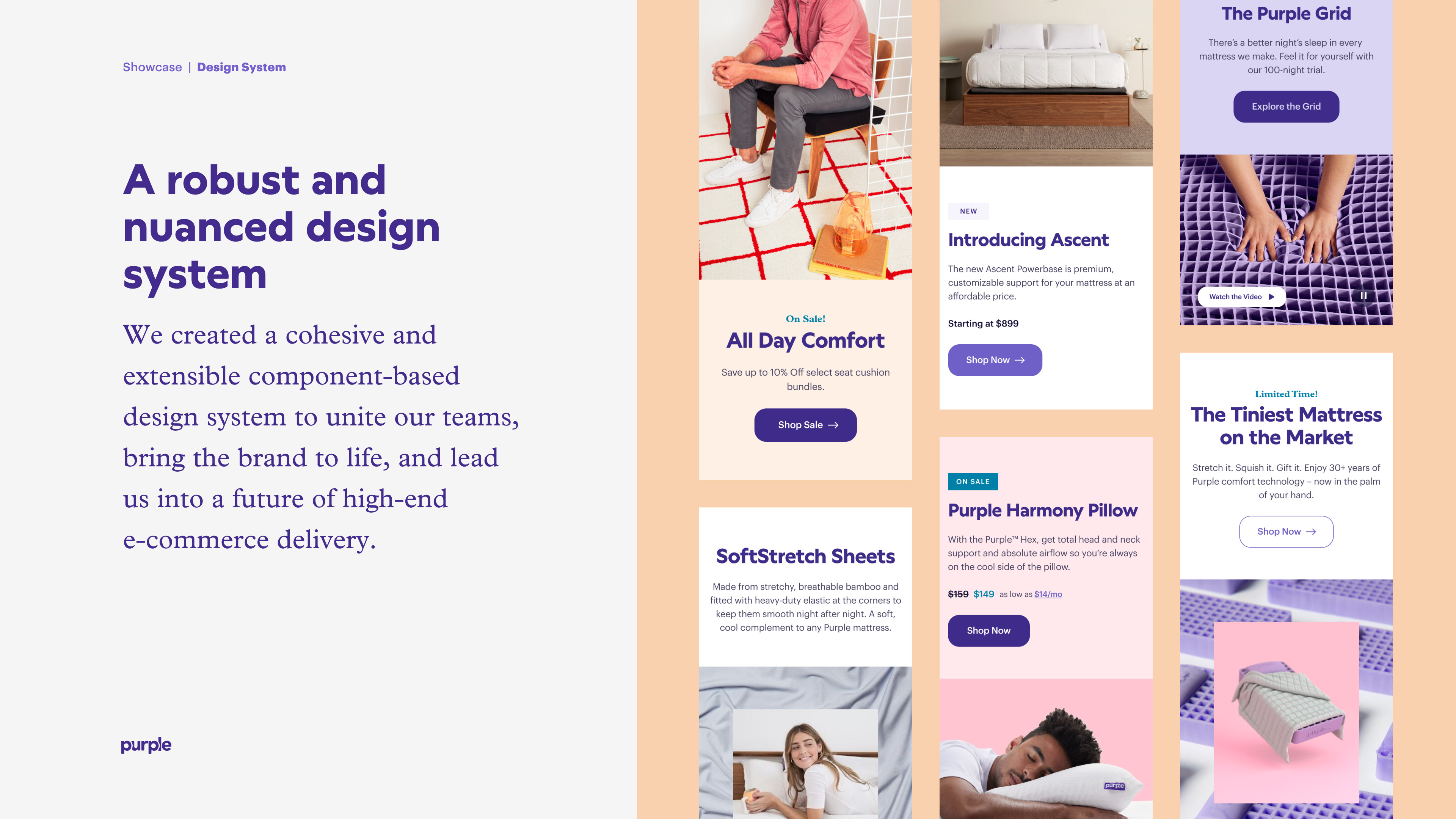
Our redesign on a high level has the goal of elevating our brand here at Purple. Although Cart & Checkout pages are very utilitarian in visual design, we still made sure to keep that goal of “brand elevation” in mind.
Our hope with elevating Purple.com is to emphasize innovation, drive commerce, build trust, and provide sleep solutions instead of just solely mattresses. With cart & checkout being a crucial part of and the bottleneck of the purchase experience, we wanted to follow these principles all the way to the end and keep them in mind as we designed this experience.
“Elevate Purple.com to reflect the quality and innovative nature of both our products and company by applying a cohesive look and feel to the entire experience”
Section from our style playbook
Surface - Style
Part of the replatform of Purple.com was implementing a new Style Guide. With the style guide in place, we had a director as to how to tackle the visual/UI design.
“The new Purple.com experience is built using a robust, modular design system — a kit of parts that powers the website. The system includes buying tools, promotional and merchandising modules, content, and global UI elements required to build a best-in-class e-commerce experience.”
First Design Iterations
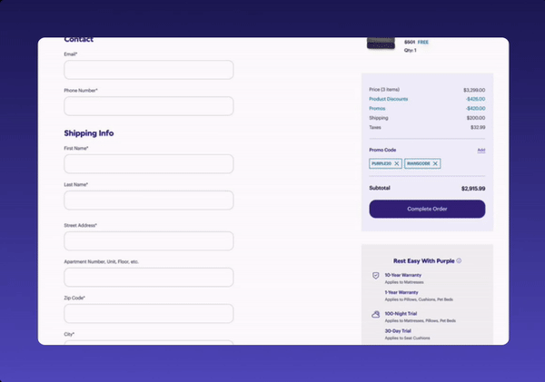
In the first stages of design, we were instructed to update as little as possible as far as the flow goes, but to only focus on the CSS and UI. This was a struggle at first, because as was stated previously, there were so many clear areas where we could improve the UX of the cart & checkout (one of them being converting the experience to a stepped checkout). The designs I was going off of were from a previous attempt at a re-platform with another third party company that fell through.
Although we were limited by the constraints, being able to update the visuals was big improvement to not only the proposed designs we were going off of, but also the designs of cart & checkout that were on Purple.com at the time. We felt comfortable with these improvements for an MVP. While these updated designs were launched as an MVP, we were able to iterate and test upon a stepped checkout initiative.
Post MVP Design Thinking
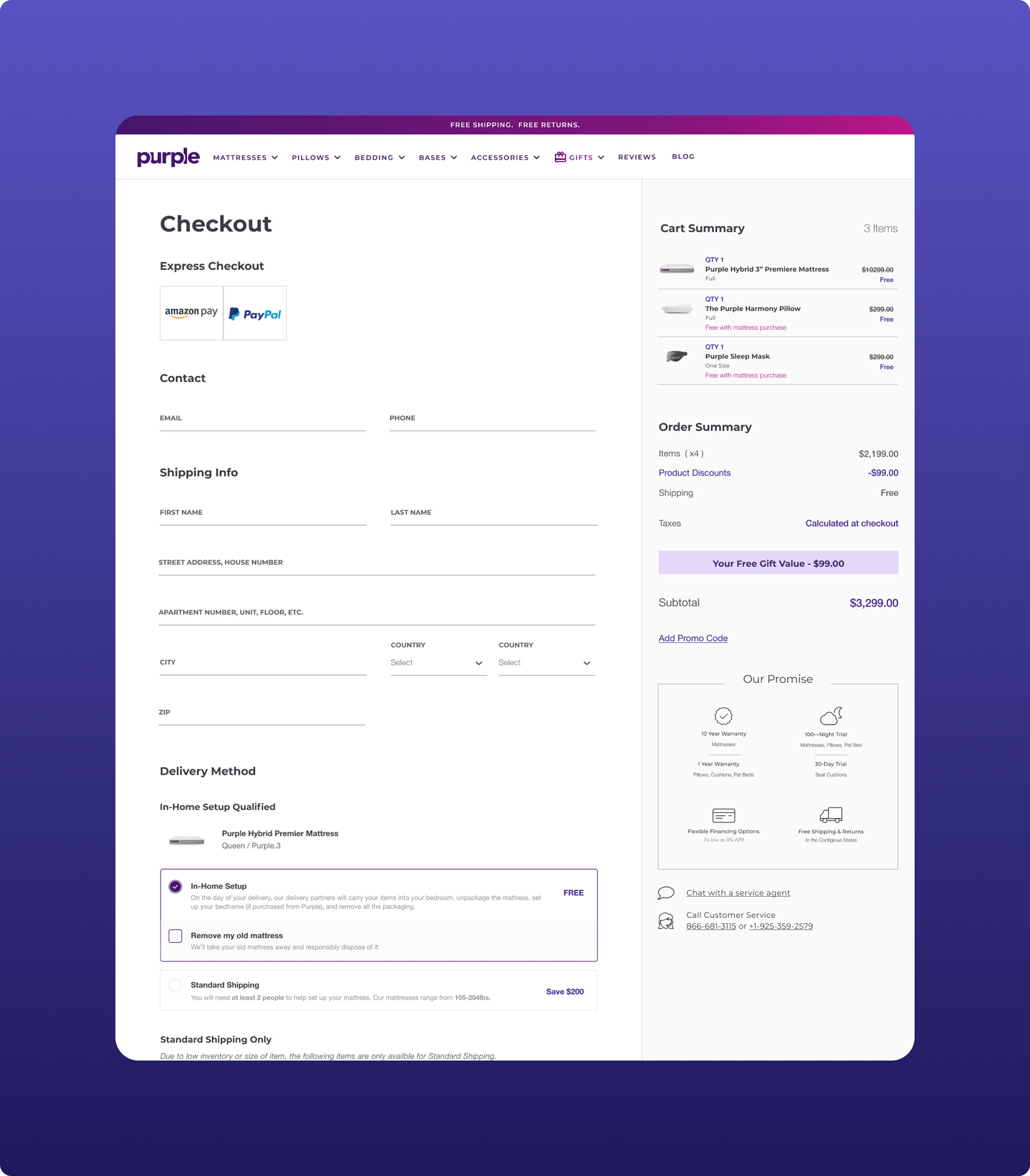
As of right now, we are vetting out an updated stepped checkout design. Even before doing our first iteration, we knew this was something we wanted to tackle post MVP considering how much scrolling is required for the MVP design; also, more condensed, progressively disclosed, and stepped checkouts are being used on the best eCommerce sites (Nike being a main source of inspiration). Here are our reasons for a stepped checkout summarized:
- We are trying to streamline the steps of checkout since each section needs to be validated and error-checked on the backend
•We want to progressively disclose the info on the page to avoid overwhelming the user
•We want to clean up the UI design and consolidate the user flow
Second Iteration Designs
With our second iteration, we really wanted to hone in on the stepped checkout design to clean up the UI with progressively disclosed steps in the hopes the user would not be overwhelmed; also, we wanted to make the UX flow more linear as to prevent the user from encountering any validation errors by jumping ahead to different sections of the checkout flow.
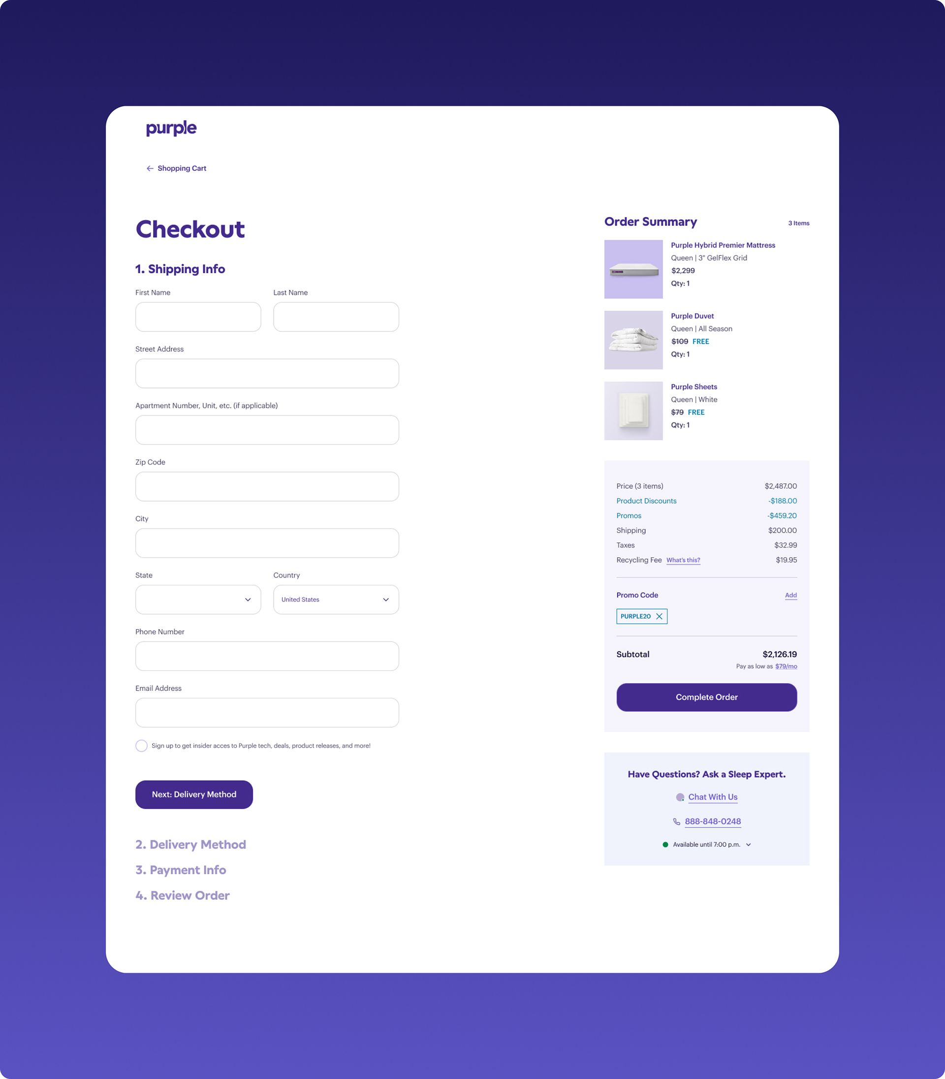
Stepped Checkout: Shipping Info Step
Stepped Checkout: Review Order
Success Metrics
With the changes in cart and checkout and Purple.com overall, we saw significant site performance improvements despite a decline in revenue. The focus on enhancing our user experience led to a reduction in bounce rates and increased session durations. These changes were a direct result of our redesign across the site.
Despite the hard times purple was going through, it was validating and comforting to know that our users were atleast having a better time on our site.