The Problem?
In the words of Justin Haskell, the CEO of Maximum Senior Benefits (MSB) the company's site was "pathetic" He came to our team asking for a complete revamp of his site. He wanted us to create a modern, sleek, and most importantly, a credible site.
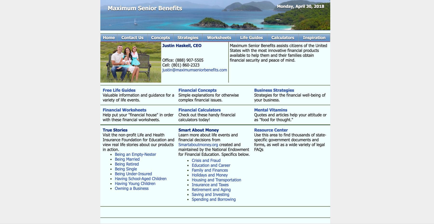
Landing Page Before Project
User Stories:
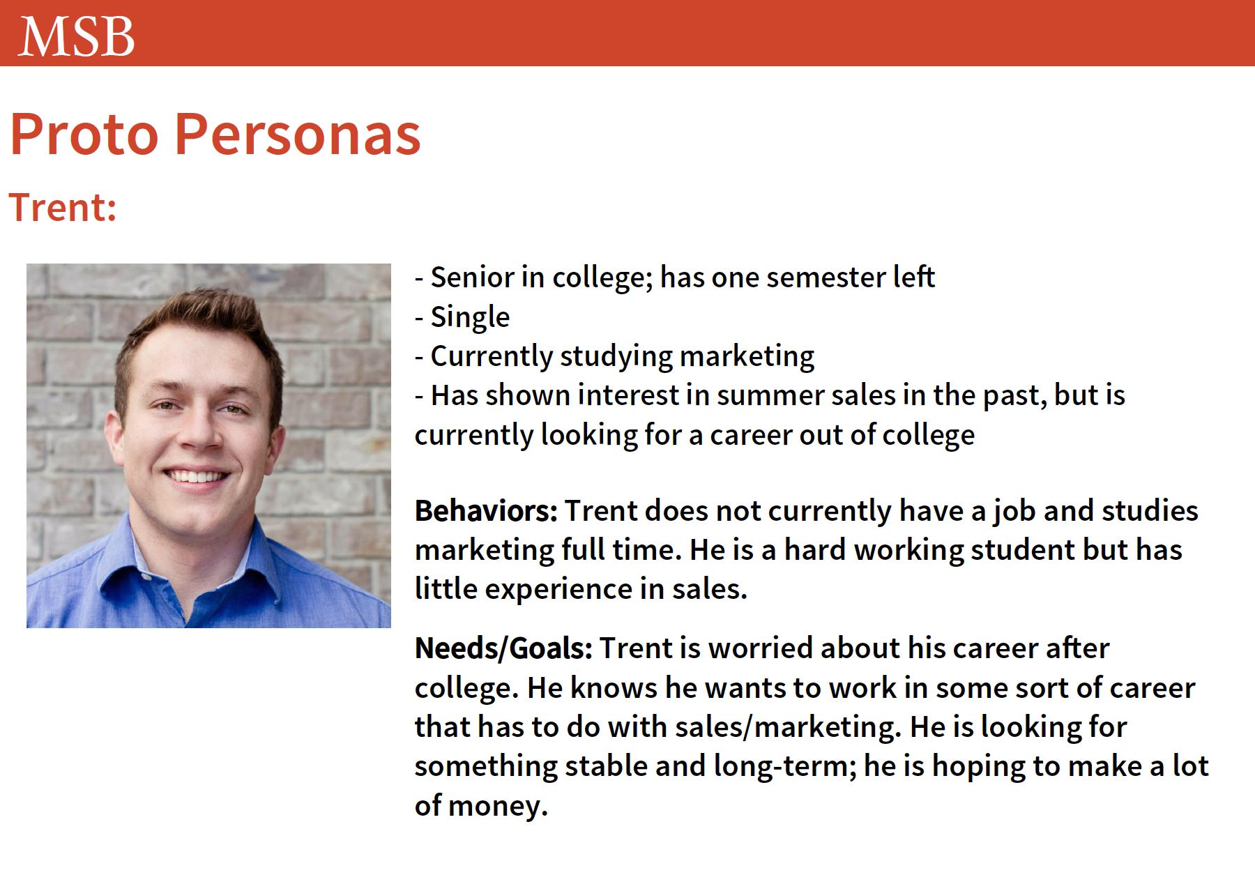
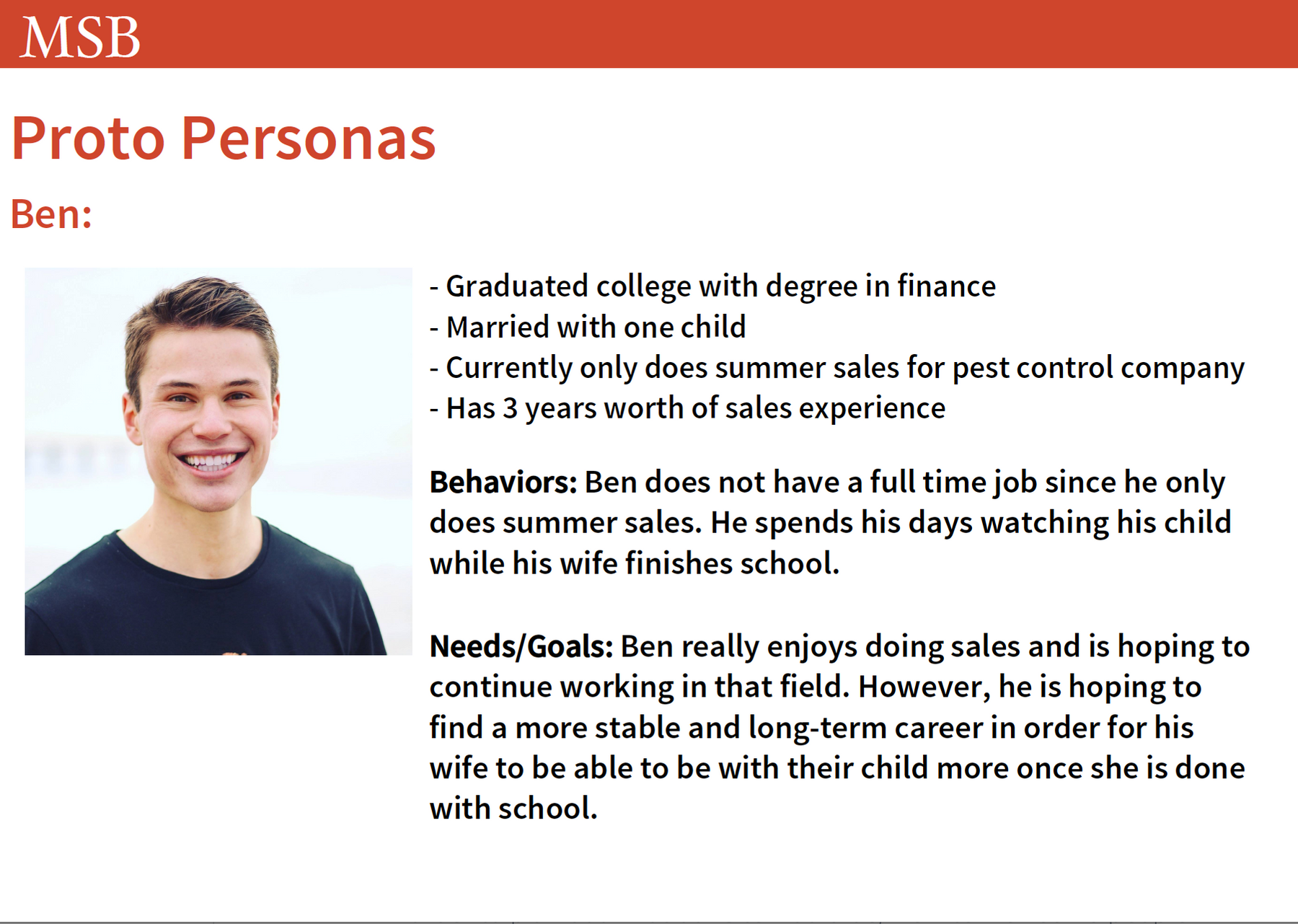
In order to plan out what our site would be, we interviewed 10 people in each in order to find an audience for the site. I interviewed friends and acquaintances of me that are working or had worked in sales. The interviews were set up in a way that I could see what kind of site would appeal to them and what features they would seek from that site. From these interviews, I created two personas.
After creating our personas, we collaborated in combining their attributes to create three personas. With the personas created, we were able to have a better idea of what requirements we had for our site.
Preliminary Designs
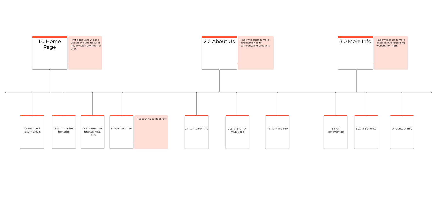
After deciding on the site requirements, we were set to start putting together the information architecture of the site. Before any design though, we had to set up the site map. The site map shows the structure of the site; basically, which pages will be on the site and where they will fall within the site.
Wireframe Design
After I completed my sketches, I brought the designs to an app called Sketch. From there I replicated the sketches I made into primitive wireframes in order to show what the site would like from purely a functional level.
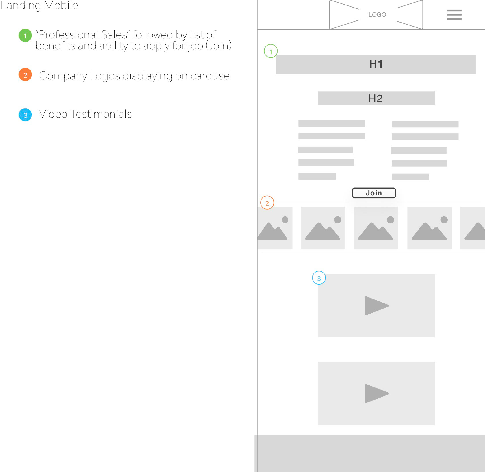
Mobile Wireframe
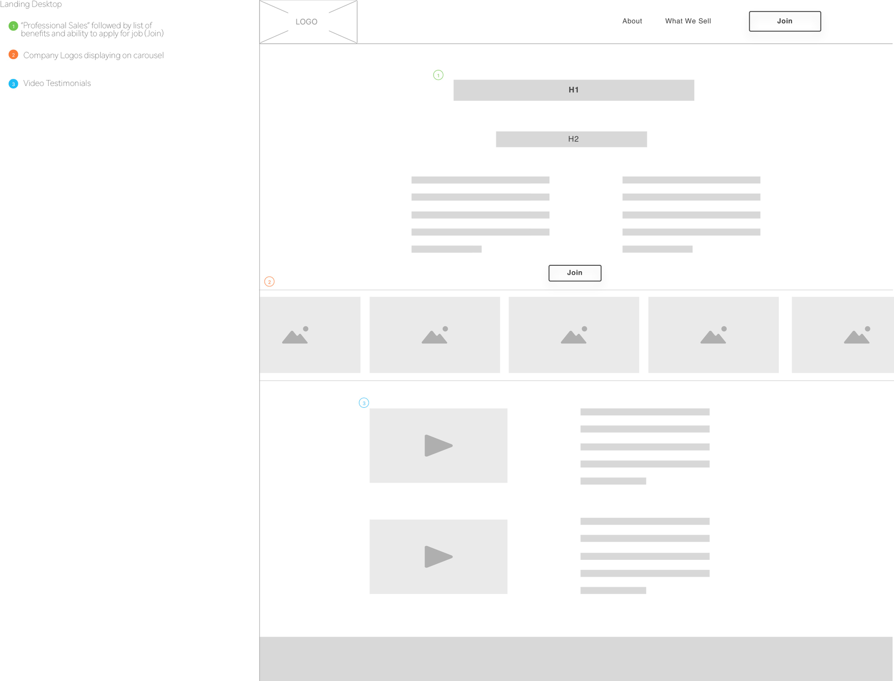
Desktop Wireframe
Prototyping and Testing
After creating the wireframes, we created a prototype. We put our wireframes together, decided on the best aspects of each one, and worked together to create a testable prototype.
This part of the project is where I feel like I was able to shine most. I worked as a Usability Specialist at my work place; with this experience, I volunteered to create the script for our test.
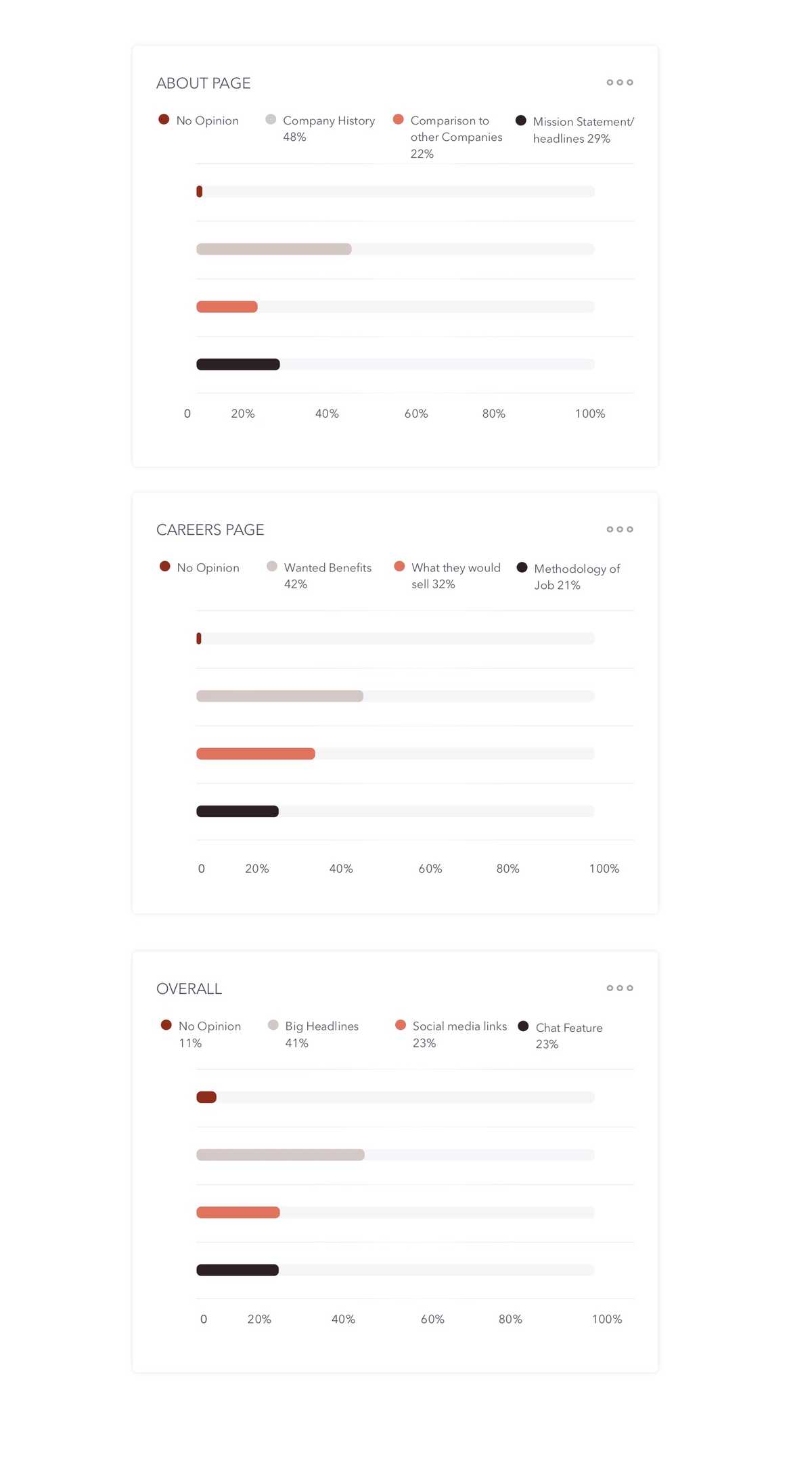
Each of us tested five subjects with the following questions:
1. From the landing page, what do you think the purpose of the site is?
2. What information would you expect to find on the about page?
3. What information would expect to find on the what we sell page?
4. What do you think of the for design on each page? What would you change?
5. Overall, what would make your experience on this site more pleasant?
With these questions, we were able to see what users thought of our site and what they may like to see improved on it.
Finalization
With the usability tests completed, each member of our team worked on various aspects of the final presentation of the design doc for Justin. I focused on writing the appendix for the doc. I felt confident working on the appendix with my experience in usability.
I organized the appendix with our test plan, test script, results, and suggestions for the site. I did this in a way that Justin would understand our intention with the tests and what the outcomes were.