The Problem?
During my time as an Information Team Lead at doTERRA, I managed our internal knowledge base. However, we also had an external help site that our marketing team handled. Although I wasn't a member of the team, I noticed some pain points regarding the UX of the site.
The main hiccup is the hierarchy on the site and the lack of progressive disclosure. It is hard to know where to start and where to maximize your time efficiently on the site. But on top of that, the search also is finicky and the articles themselves can be difficult to read as they are housed within the parameters of the main window on the landing page.
My goal was to design a much more user friendly experience.
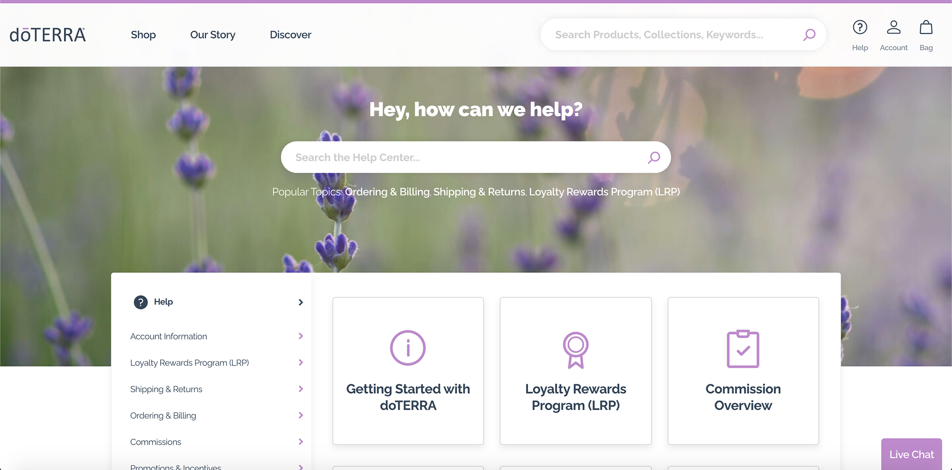
Landing Page.
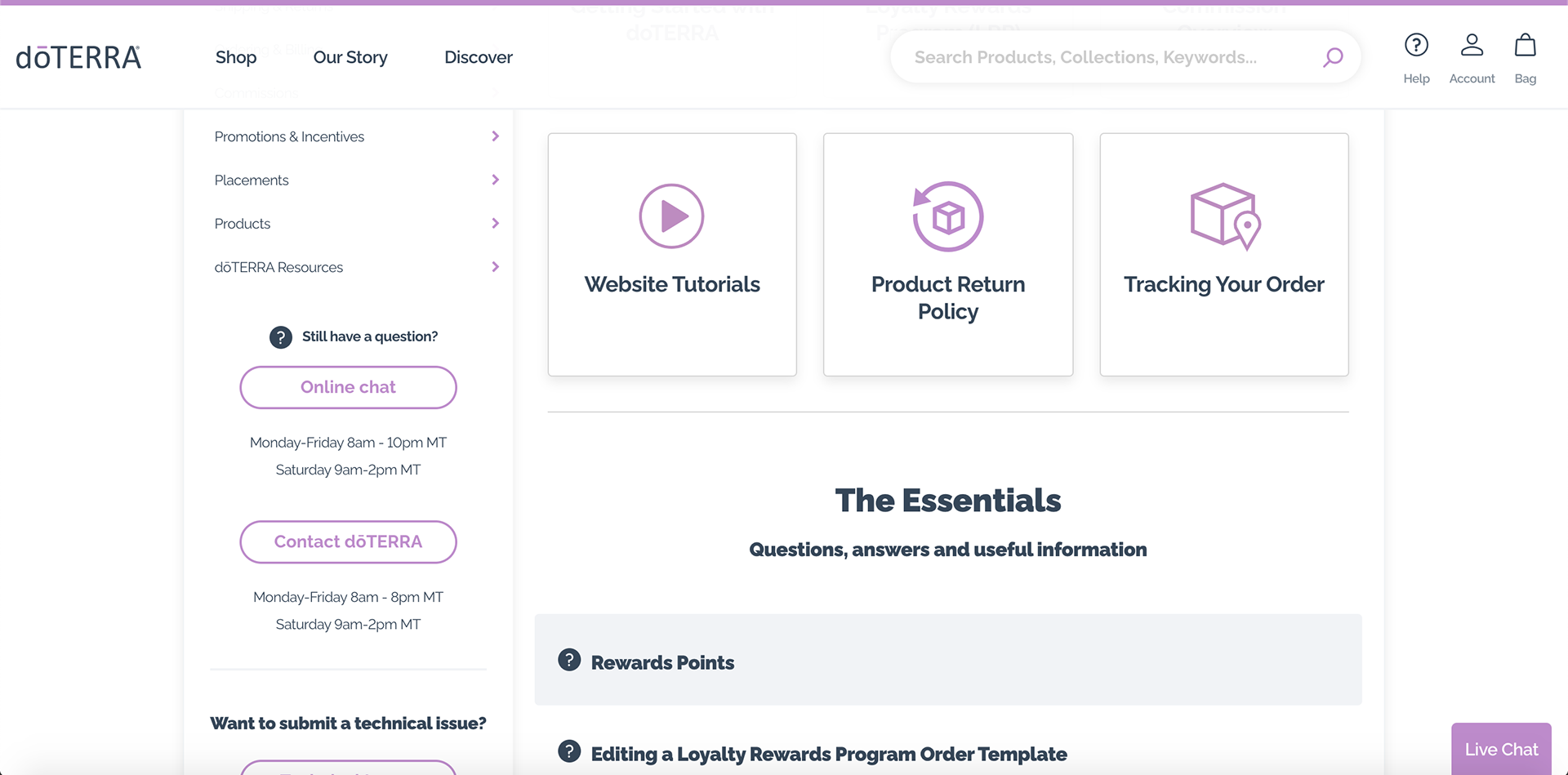
Landing Page Scrolled Down
The Solution?
I looked at various help centers and knowledge bases for inspiration. And what I noticed was the best help centers tend to lead the user through the landing page with the most viewed pages first, and then the topics from most viewed to least viewed in a gird format; this hierarchy. My hope was to create a more natural experience.
Unfortunately, I was unable to test or validate these designs. But, I do believe my designs are a much more simple solution to the confusion of the current help center.
You can see the full prototype here.
Prototype in Action
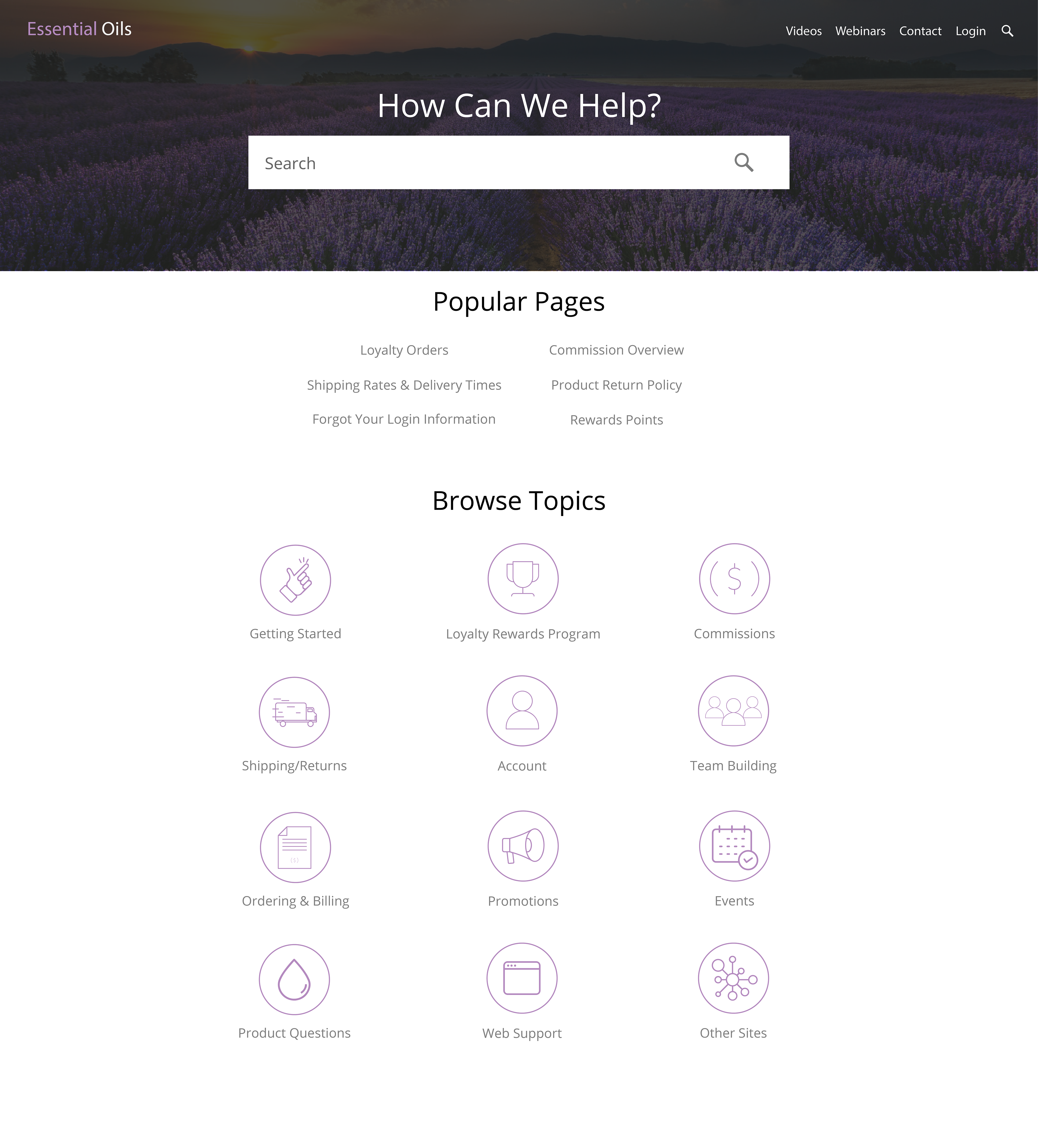
Home Page Design
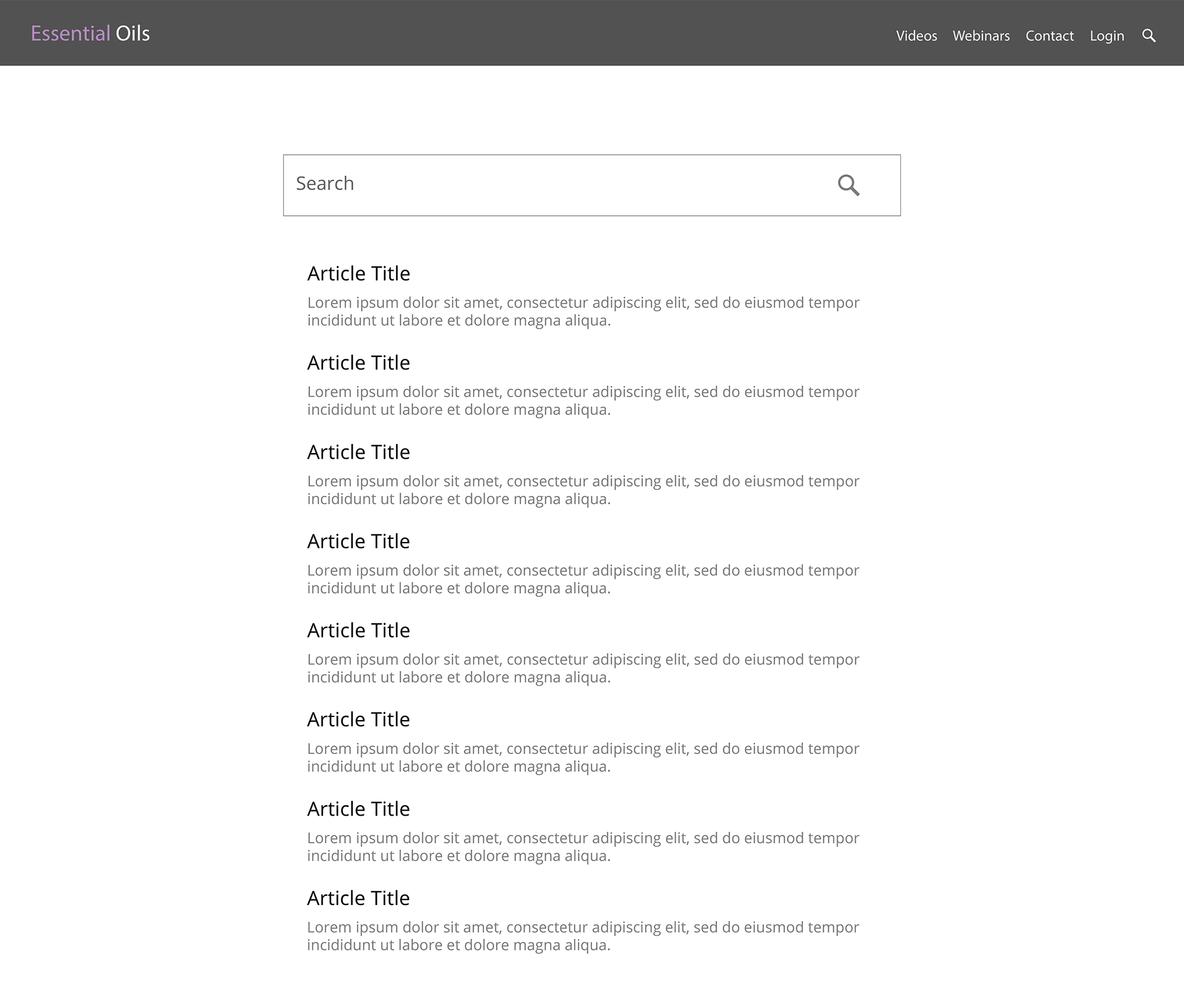
Search Result Page
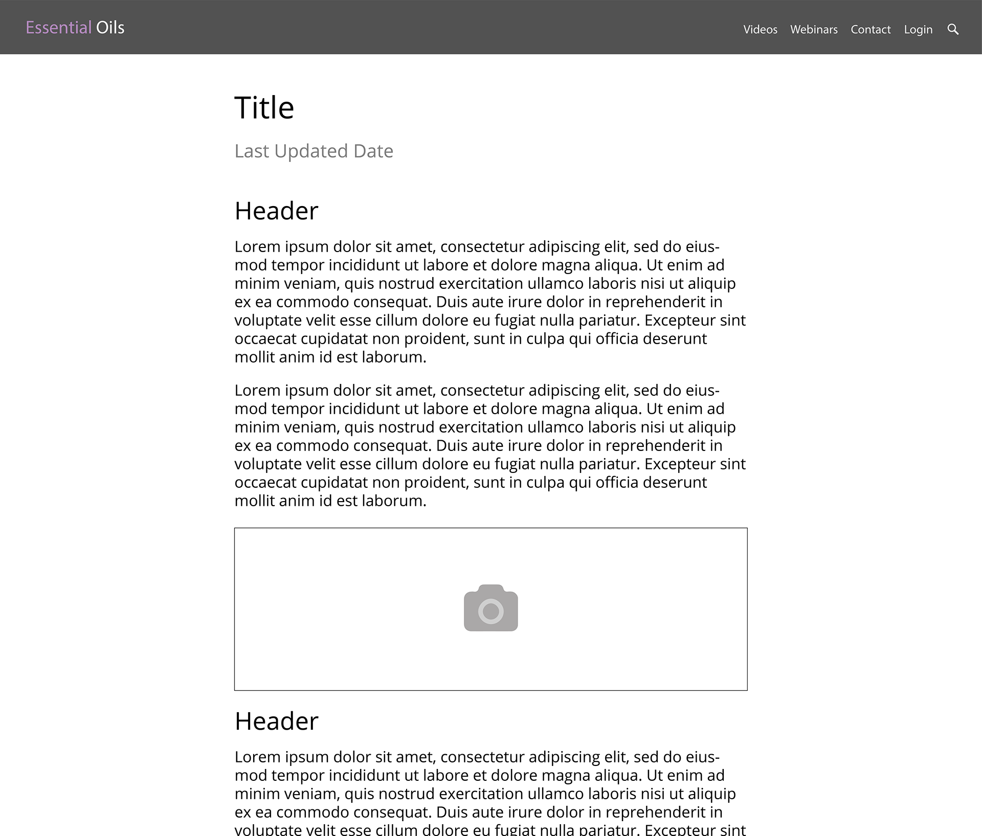
Article Page