The Problem?
Animal Crossing is a game near to my heart and that of many others. However, despite how wonderful the game is, there are some glaring flaws in its UX in regards to some of the in game mechanics. These mechanics include inventory management, crafting, and shopping. My hope was to research these problems and come up with solutions as to how to improve them.
User Research
Although I had an idea as to what could be improved, I wanted to reach out to the game's audience. In order to do this, I went to reddit and asked fellow Animal Crossing players what parts of the game's UX design bugged them the most. You can see the original post here.
I also polled my family; my five sisters all play Animal Crossing (a lot more than me even) and they shared some of their thoughts.
From this, I gathered three main pain points: crafting multiple items, tool durability, and a lack of a shopping cart function.

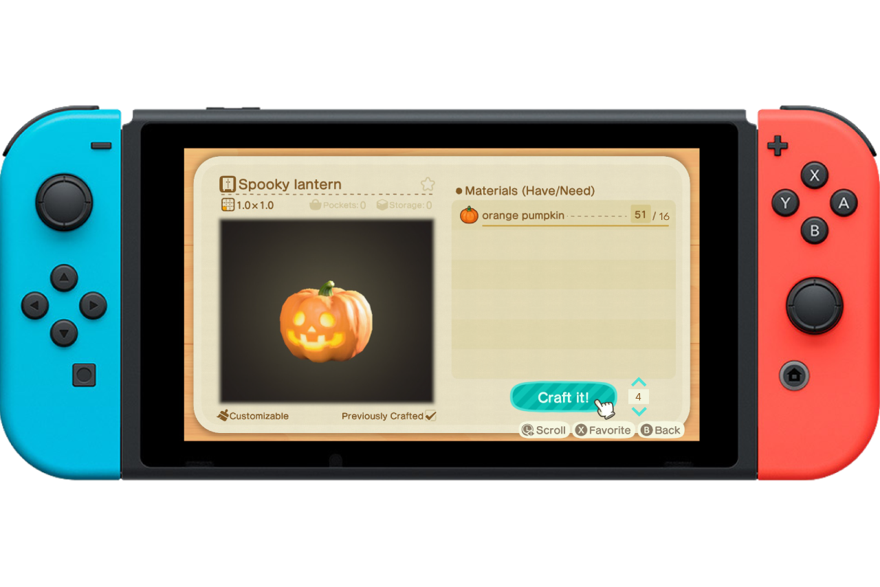
Crafting Window - You can only craft one item at a time.
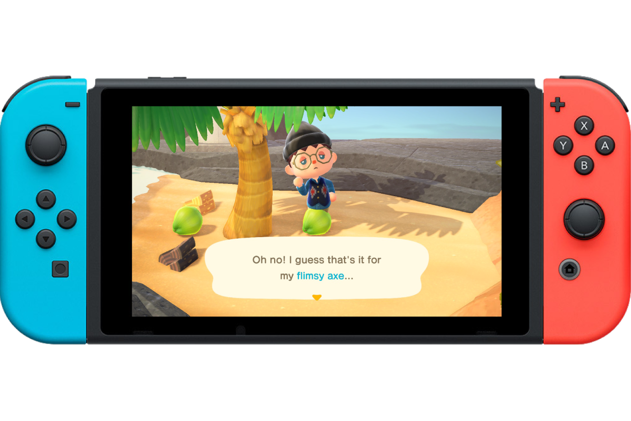
Crafted tools break often without warning
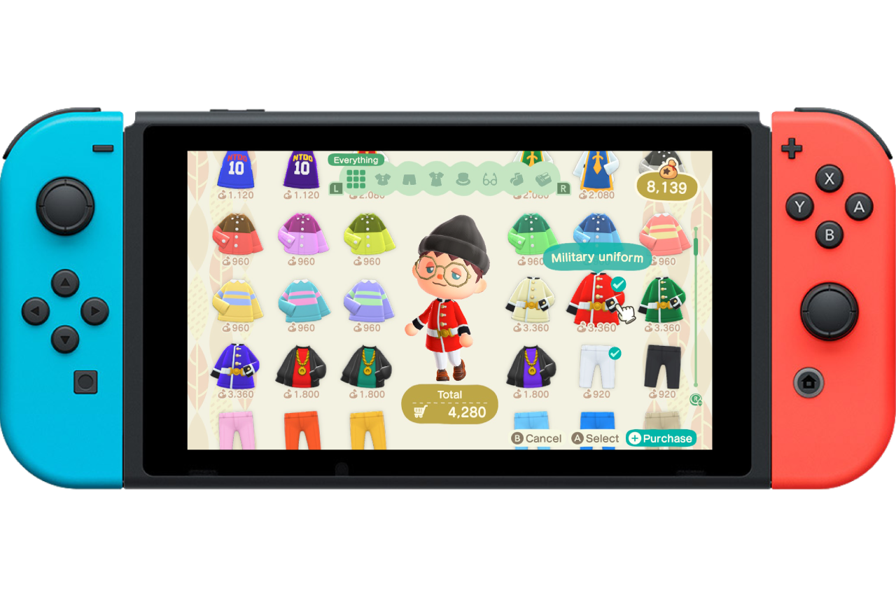
Shopping Window - You can only select one of each type of item at a time.
Ideation
Before diving into high fidelity solutions, I worked with a colleague I had met in school for sketching out some design ideas. She is an international student who is currently living in Japan. It was awesome collaborating a project with someone so far away and with potentially different perspectives.
I shared with her the data I had gathered and she sketched out some ideas of how we could address those issues.
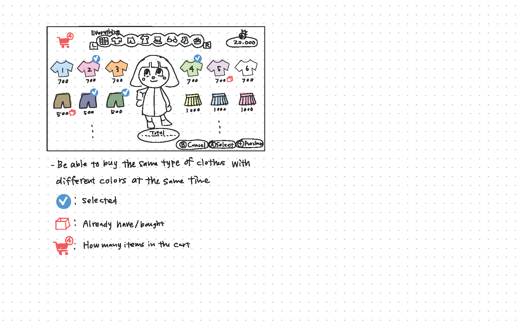
One of my colleague's design sketches
Designing Solutions
With my colleague's sketches, I felt ready to do tackle some high fidelity mockups. I simply took screen shots from my game and designed the new interface elements on top of the game. These are simple solutions, so not a ton of design work was required.
Crafting Multiple Items:
The top complaint was the lack of being able to craft more than one item at a time. Crafting can be a cumbersome process as you have to watch a lengthly animation each time you craft. Why not just save the time and let the player craft more than one item at a time?
In my design, I just added a simple number text box with arrows so you can craft multiple items. As long as the player has the necessary materials in game, it would work seamlessly.
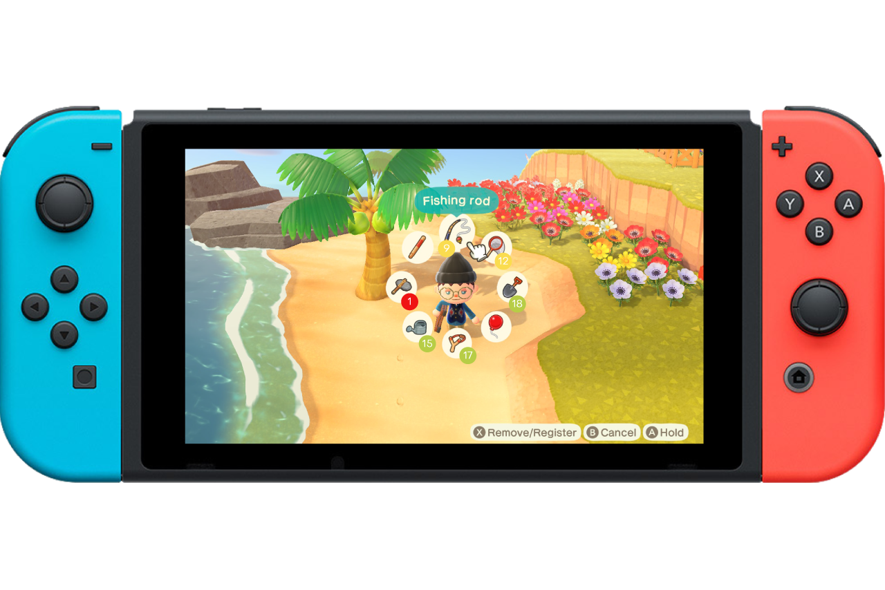
Tool Durability:
With crafting, a player can make tools in order to complete various tasks in the game. However, the tools have a finite use. What is frustrating is that the player has no indication as to when their tool will break. This is an unnecessary set back that can be easily mended if there was a simple way to see how much more life your tool had.
The solution for this was adding a number of uses to each tool. The colors from green to red indicate a sort of good, medium, and critical state along with the numbers.
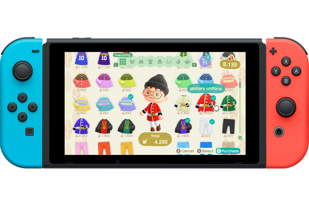
Shopping Cart:
When shopping, you only able to buy/select one of each type of item at a time. This is a super odd oversight. Why can it not just replicate a shopping experience that we are familiar with on the web?
With this insight, the solution was to add a shopping cart feature in which you could select multiple items and just add them to a cart. You could still preview the clothing you are browsing by hovering the cursor over the corresponding clothing; but the ability to add to a shopping cart takes away the unnecessary need to purchase, exit, return, and repeat.
Design Validation
With the first mockups created, I wanted to reach out to those I originally polled to see if I could make any improvements to my designs. Prototyping was not an option considering this is a Switch game and I was unable to replicate an accurate gameplay experience. However, I still was able to gather data from a qualitative survey.
I simply asked my subjects to rate each designs' effectiveness from 1-10. I also asked if there were any improvements that could be made to each design. I surveyed six test subjects, and they provided meaningful data as to how I could make my designs even better.
You can view the survey result spreadsheet here.
Application
With the test results in, I had ample data to improve my designs. Although the changes were minor, they were changes asked for by the user and I think they overall improve the effectiveness of each design. Below I will list the changes I made along with a quote or two from the user survey I performed.
The crafting menu was simple, I only changed the size of the feature to have it pop a bit more.
"Bigger icon. I’m blind."
With tool durability, I changed the colors of the circles in order for the number of hits to be more visible; also the colors are more in line with the UI color scheme of the game.
"Maybe change the colors?"
As for the shopping cart feature, a lot of users didn't notice the shopping cart in the survey so I went out of my way to have it pop more on the screen.
"Make the shopping cart icon a bit bigger?"
"Maybe have a visible cart, so you can see what you’ve added to your cart so far without having to scroll and look for check marks?"

Redesigned Crafting Menu
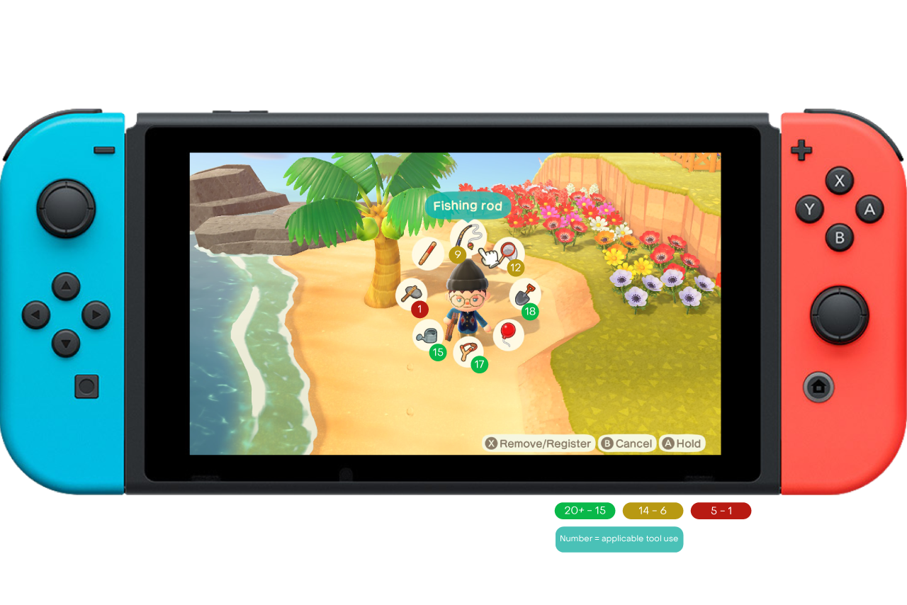
Redesigned Tool Durability with key
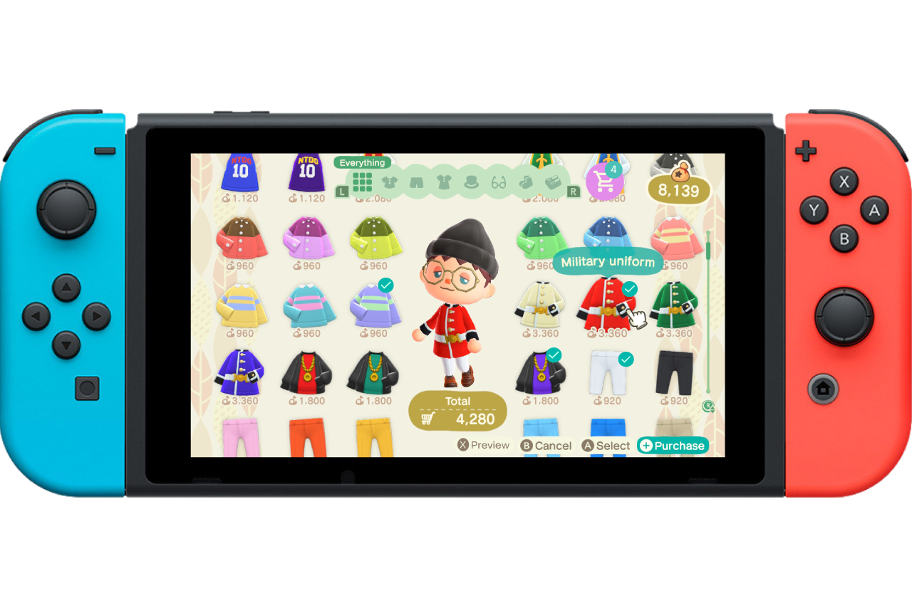
Redesigned Shopping Cart feature
Conclusion
It was fun to tackle a UX project outside of the realm of web and app design. It just comes to show that sound UX principles can be applied to any product, be it software or physical. Although this was a software based project, I really do believe that aspects of UX can be found everywhere in our lives.
On top of that, it was fun to headline a more personal project outside of work and school. The same skills and principles that I have learned from years of experience came in handy when analyzing one of my favorite video games.